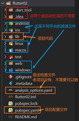
Flutter的目录结构
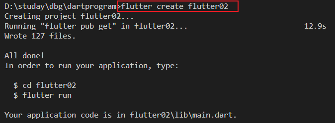
创建flutter项目,除了在Android studio中创建,还可以使用命令行进行创建。我们进入想要创建的目录,输入命令 flutter create flutter02 就创建了一个叫 flutter02 的flutter项目。
下面看一下项目的结构
Flutter的入口文件
Flutter的入口文件是 lib/main.dart , 入口方法是 main 函数,在这个函数中通过 runApp() 方法就可以调用内置组件或者我们写的组件来进行页面布局。
我们可以把这个文件中的内容都删掉然后自己写。
首先我们要引入库 import 'package:flutter/material.dart';,然后利用一些提供的组件进行编写
1
2
3
4
5
6
7
| void main() {
runApp(const Center(
child: Text("你好Flutter",
textDirection: TextDirection.ltr,
style: TextStyle(color: Color.fromRGBO(212, 23, 23, 1), fontSize: 40)),
));
}
|
用MaterialApp 和 Scaffold两个组件来装饰App
MaterialApp
MaterialApp是一个方便的Widget,它封装了应用程序实现Material Design所需要的一些Widget。一般做顶层的widget使用
常用的属性
home: 主页
title: 标题
color: 颜色
theme: 主题
routes: 路由
Scaffold
Scaffold是Marterial Design布局结构的基本实现,此类提供了用于显示drawer、snackbar和底部sheet的API
Scaffold有下面几个主要属性
appBar:显示在界面顶部的一个AppBar
body:当前界面所显示的主要内容Widget
drawer:抽屉菜单控件
使用上面两个组件
1
2
3
4
5
6
7
8
9
10
11
12
13
14
| import 'package:flutter/material.dart';
void main() {
runApp(MaterialApp(
home: Scaffold(
appBar: AppBar(title: const Text("你好Flutter")),
body: const Center(
child: Text("你好Flutter",
textDirection: TextDirection.ltr,
style:
TextStyle(color: Color.fromRGBO(212, 23, 23, 1), fontSize: 40)),
),
),
));
}
|
Flutter把内容抽离成单独一个组件
在Flutter中自定义组件就是一个类,这个类继承StatelesWidget/StatefulWidget
StatelessWidget是一个无状态组件,状态不可改变的widget
StatefulWidget是一个有状态组件,持有的状态可能在widget生命周期改变
1
2
3
4
5
6
7
8
9
10
11
12
13
14
15
16
17
18
19
20
21
22
| import 'package:flutter/material.dart';
void main() {
runApp(MaterialApp(
home: Scaffold(
appBar: AppBar(title: const Text("你好Flutter")), body: const MyApp()),
));
}
class MyApp extends StatelessWidget {
const MyApp({super.key});
@override
Widget build(BuildContext context) {
return const Center(
child: Text("你好Flutter",
textDirection: TextDirection.ltr,
style:
TextStyle(color: Color.fromRGBO(212, 23, 23, 1), fontSize: 40)),
);
}
}
|
Flutter中的组件
Container容器组件
类似于html中的div
height 容器高度
width 容器宽度
child 容器子元素
margin 表示Container与外部其他组件的距离。Edgelnsets.all(20.0),
padding 就是Container的内边距,指Containeri边缘与Child之间的距离, padding:Edgelnsets.all(10.0)
alignment 用来设置container内部容器的位置。
topCenter 顶部-居中
topLeft 顶部-居左
topRight 顶部-居右
center 水平居中-垂直居中
centerLeft 垂直居中-水平居左
centerRight 垂直居中-水平居右
bottomCenter 底部-居中
bottomLeft 底部-居左
bottomRight 底部-居右
decoration 用来改变container的样式。边框,阴影,背景色等
1
2
3
4
5
6
7
8
9
10
11
12
13
14
15
16
17
| decoration: BoxDecoration(
color: const Color.fromARGB(255, 15, 9, 132),
border: Border.all(
color: const Color.fromARGB(255, 0, 0, 1),
width: 2.0),
borderRadius: BorderRadius.circular((8)),
boxShadow: const [
BoxShadow(
color: Colors.blue,
offset: Offset(10.0, 12.0),
blurRadius: 40
)
],
gradient: const LinearGradient(
colors: [Colors.red, Colors.orange],
)
)
|
transform 让Container容易进些旋转之类的
1
2
3
| transform: Matrix4.translationValues(10, 0, 0),
transform: Matrix4.rotationZ(0.5),
transform: Matrix4.skewX(0.2),
|
1
2
3
4
5
6
7
8
9
10
11
12
13
14
15
16
17
18
19
20
21
22
23
24
25
26
27
28
29
30
31
32
33
34
35
36
37
38
39
40
41
42
43
44
45
46
47
48
49
50
51
52
53
54
55
56
57
58
59
60
61
62
63
64
65
66
67
68
69
| import 'package:flutter/material.dart';
void main() {
runApp(MaterialApp(
home: Scaffold(
appBar: AppBar(title: const Text("你好Flutter")),
body: Column(
children: const [MyApp(), MyButton()],
)),
));
}
class MyApp extends StatelessWidget {
const MyApp({super.key});
@override
Widget build(BuildContext context) {
return Center(
child: Container(
alignment: Alignment.center,
margin: const EdgeInsets.fromLTRB(0, 40, 0, 20),
width: 100,
height: 200,
decoration: BoxDecoration(
color: const Color.fromARGB(255, 15, 9, 132),
border: Border.all(
color: const Color.fromARGB(255, 0, 0, 1),
width: 2.0),
borderRadius: BorderRadius.circular((8)),
boxShadow: const [
BoxShadow(
color: Colors.blue,
offset: Offset(10.0, 12.0),
blurRadius: 40
)
],
gradient: const LinearGradient(
colors: [Colors.red, Colors.orange],
)
),
child: const Text(
"你好吗",
style: TextStyle(color: Color.fromRGBO(9, 251, 251, 1), fontSize: 20),
),
),
);
}
}
class MyButton extends StatelessWidget {
const MyButton({Key? key}) : super(key: key);
@override
Widget build(BuildContext context) {
return Container(
alignment: Alignment.center,
width: 200,
height: 40,
margin: const EdgeInsets.fromLTRB(0, 10, 0, 10),
decoration: BoxDecoration(
color: Colors.blue, borderRadius: BorderRadius.circular(20)),
child: const Text(
"按钮",
style: TextStyle(color: Colors.white, fontSize: 20),
),
);
}
}
|
Text组件
这个是文本组件
- textAlign 文本对齐方式(center,left,right,justfy)
- textDirection 文本方向(ltr从左到右,rtl从右到左)
- overflow 文字超出后的处理方式(clip裁剪,fade隐藏,ellipsis省略号)
- textScaleFactor 文字显示倍率
- maxLines 文字显示最大行数
- style 字体的样式
TextStyle的参数
decoration 文字装饰线(none 没有线,lineThrough删除线,overline上划线,underline下划线)decorationColor 文字装饰线颜色decorationStyle 装饰线风格(dashed,dotted虚线,double两个线,solid实线,wavy波浪线)wordSpacing 单词间隙(如果是负值会变紧凑)letterSpacing 字母间隙fontStyle 文字样式(italic斜体,normal正常体)fontSize 文字大小color 文字颜色fontWeight 字体粗细(bold粗,normal正常)
图片组件
Flutter中,我们可以通过Image组件来加载并显示图片Image的数据源可以是asset、文件、内存以及网络。
Image.network 加载网络图片
- width和height 配合ClipOval才能看到效果
- alignment 图片在外部容器的位置
- color和colorBlendMode 设置图片的背景颜色,通常和colorBlendMode一起使用,这样可以是图片颜色和背景色混合。
- fit 控制图片的拉伸和挤压,根据父容器来
BoxFit.fill 全图显示,图片会被拉伸,充满父容器
BoxFit.contain 全图显示,显示原来的比例,可能父容器有空隙
BoxFit.cover 显示可能拉伸,可能裁切,充满(图片充满整个容器,不变性)
BoxFit.fitWidth 宽度充满
BoxFit.fitHeight 高度充满
BoxFit.scaleDown 效果和contain差不多,但是此属性不允许显示超过源图片大小,可小不可大
- repeat 平铺
ImageRepeat.repeatX X轴平铺
ImageRepeat.repeatY Y轴平铺
ImageRepeat.repeat X和Y轴平铺
1
2
3
4
5
6
7
8
9
10
11
12
13
14
15
16
17
18
| class ImgContainer extends StatelessWidget {
const ImgContainer({Key? key}) : super(key: key);
@override
Widget build(BuildContext context) {
return Container(
height: 200,
width: 200,
decoration: const BoxDecoration(color: Colors.yellow),
child: Image.network(
"https://www.itying.com/themes/itying/images/ionic4.png",
scale: 2,
alignment: Alignment.bottomCenter,
fit: BoxFit.fill,
),
);
}
}
|
Image.assets 加载本地图片
加载本地图片之前,需要进行下面的准备
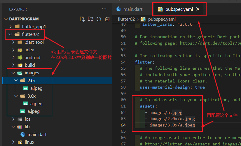
本地图片这个属性没有什么差别,主要是要放在目录下并配置pubspec.yaml文件
1
2
3
4
5
6
7
8
9
10
11
12
13
14
15
16
| class localImg extends StatelessWidget {
const localImg({Key? key}) : super(key: key);
@override
Widget build(BuildContext context) {
return Container(
height: 150,
width: 150,
decoration: const BoxDecoration(color: Colors.yellow),
child: Image.asset(
"images/a.jpeg",
fit: BoxFit.cover,
),
);
}
}
|
实现圆形图片
1
2
3
4
5
6
7
8
9
10
11
12
13
14
15
16
17
18
19
20
21
22
23
24
25
26
27
28
29
30
31
32
33
34
35
36
37
38
39
40
41
42
43
44
45
46
47
48
49
50
51
52
53
54
55
56
57
58
59
60
61
62
63
64
65
66
67
68
69
70
71
72
|
class Circular extends StatelessWidget {
const Circular({Key? key}) : super(key: key);
@override
Widget build(BuildContext context) {
return Container(
height: 100,
width: 100,
decoration: BoxDecoration(
borderRadius: BorderRadius.circular(50),
color: Colors.yellow,
image: const DecorationImage(
image: NetworkImage(
"https://www.itying.com/themes/itying/images/ionic4.png",
),
fit: BoxFit.cover)),
);
}
}
class ClipImg extends StatelessWidget {
const ClipImg({Key? key}) : super(key: key);
@override
Widget build(BuildContext context) {
return ClipOval(
child: Image.network(
"https://www.itying.com/themes/itying/images/ionic4.png",
scale: 2,
alignment: Alignment.bottomCenter,
fit: BoxFit.fill,
width: 100,
height: 100,
),
);
}
}
class CircleAvatarImg extends StatelessWidget {
const CircleAvatarImg({Key? key}) : super(key: key);
@override
Widget build(BuildContext context) {
return const CircleAvatar(
radius: 30,
backgroundImage: NetworkImage(
"https://www.itying.com/themes/itying/images/ionic4.png"));
}
}
class CircleAvatarImg extends StatelessWidget {
const CircleAvatarImg({Key? key}) : super(key: key);
@override
Widget build(BuildContext context) {
return const CircleAvatar(
radius: 30,
backgroundColor: Color.fromARGB(255, 56, 54, 54),
child: CircleAvatar(
radius: 25,
backgroundImage: NetworkImage(
"https://www.itying.com/themes/itying/images/ionic4.png")),
);
}
}
|
图标组件
内置图标
官方内置图标库,里面可以查看一些图标以及使用。
内置图标组件是Icon() 我们可以点进源码看有什么参数一般用法如下
1
2
3
4
5
6
7
8
9
10
11
12
13
14
15
16
17
| class IconContainer extends StatelessWidget {
const IconContainer({Key? key}) : super(key: key);
@override
Widget build(BuildContext context) {
return Column(
children: const [
Icon(
Icons.home,
size: 40,
color: Colors.red,
),
Icon(Icons.drafts)
],
);
}
}
|
使用自定义图标
阿里巴巴图标库中有很多图标,方便我们选择和查找
- 首先我们在网站上选择并下载iconfont.ttf文件
- 在项目根目录创建
fonts 文件夹,并把.ttf 文件放进去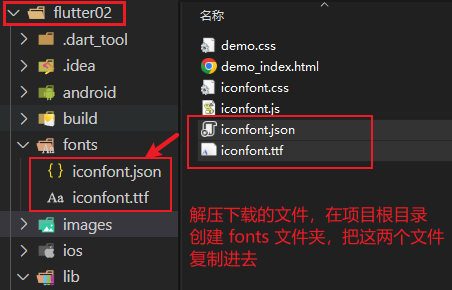
- 在
pubspec.ymal 文件中进行配置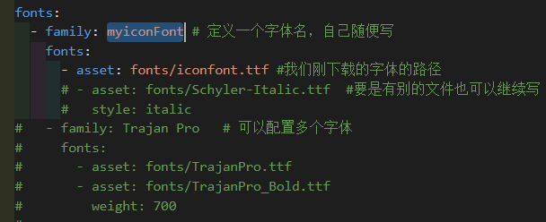
- 自定义字体的类,在
lib 目录下创建 .dart 文件放自己定义的图标类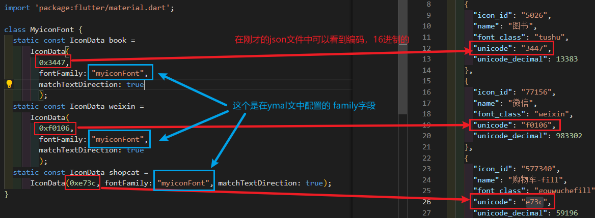
1
2
3
4
5
6
7
8
9
| import 'package:flutter/material.dart';
class MyiconFont {
static const IconData book =
IconData(0x3447, fontFamily: "myiconFont", matchTextDirection: true);
static const IconData weixin =
IconData(0xf0106, fontFamily: "myiconFont", matchTextDirection: true);
static const IconData shopcat =
IconData(0xe73c, fontFamily: "myiconFont", matchTextDirection: true);
}
|
- 在
Icon()中使用1
2
3
4
5
| Icon(
MyiconFont.book,
size: 50,
color: Colors.green,
),
|
ListView 列表组件
列表布局是我们项目开发中最常用的一种布局方式。Flutter中我们可以通过ListView:来定义列表项,支持垂直和水平方向展示。通过一个属性就可以控制列表的显示方向。列表有以下分类:
- 垂直列表
- 垂直图文列表
- 水平列表
- 动态列表
列表组件常用参数:
- scrollDirection
Axis.horizontal水平列表、Axis.vertical垂直列表
- padding 内边距
- resolve 组件反向排序
- children 列表元素
静态列表
ListView 一般会搭配LIstTile来使用
1
2
3
4
5
6
7
8
9
10
11
12
13
14
15
16
17
18
19
20
21
22
|
class MyHomePage extends StatelessWidget {
const MyHomePage({super.key});
@override
Widget build(BuildContext context) {
return ListView(
children: const [
ListTile(
title: Text("我是一个列表"),
),
Divider(),
ListTile(
title: Text("我是一个列表"),
),
Divider(),
ListTile(
title: Text("我是一个列表"),
),
],
);
}
}
|
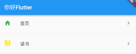
ListTile 还有一些别的属性,比如添加前后的图标,效果如下图,还可以绑定点击事件,这个后面再说
1
2
3
4
5
6
7
8
9
10
11
12
13
14
15
16
17
18
19
20
21
22
23
24
25
26
27
28
| class MyHomePage extends StatelessWidget {
const MyHomePage({super.key});
@override
Widget build(BuildContext context) {
return ListView(
children: const [
ListTile(
leading: Icon(
Icons.home,
color: Colors.green,
),
title: Text("首页"),
trailing: Icon(Icons.chevron_right_sharp),
),
Divider(),
ListTile(
leading: Icon(
MyiconFont.book,
color: Colors.yellow,
),
title: Text("读书"),
trailing: Icon(Icons.chevron_right_sharp),
),
Divider(),
],
);
}
}
|
1
2
3
4
5
6
7
8
9
10
11
12
13
14
15
16
17
18
19
20
21
22
23
24
25
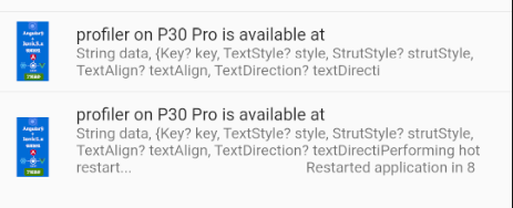
| class MyHomePage extends StatelessWidget {
const MyHomePage({super.key});
@override
Widget build(BuildContext context) {
return ListView(
children: [
ListTile(
leading: Image.network(
"https://www.itying.com/themes/itying/images/ionic4.png"),
title: const Text("profiler on P30 Pro is available at"),
subtitle: const Text(
"String data, {Key? key, TextStyle? style, StrutStyle? strutStyle, TextAlign? textAlign, TextDirection? textDirecti"),
),
const Divider(),
ListTile(
leading: Image.network(
"https://www.itying.com/themes/itying/images/ionic4.png"),
title: const Text("profiler on P30 Pro is available at"),
subtitle: const Text(
"String data,Key? key, TextStyle? style, StrutStyle? strutStyle, TextAlign? textAlign, TextDirection? textDirectiPerforming hot restart.. Restarted application in 8"),
),
],
);
}
}
|
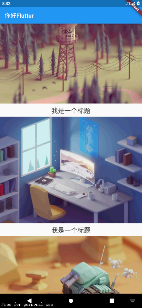
除了ListTile,ListView中还可以随意放其它的组件
1
2
3
4
5
6
7
8
9
10
11
12
13
14
15
16
17
18
19
20
21
22
23
24
25
26
27
28
29
30
31
32
33
34
35
36
37
| class MyHomePage extends StatelessWidget {
const MyHomePage({super.key});
@override
Widget build(BuildContext context) {
return ListView(
children: [
Image.network("https://www.itying.com/images/flutter/1.png"),
Container(
padding: const EdgeInsets.fromLTRB(0, 6, 0, 0),
height: 44,
child: const Text("我是一个标题",
textAlign: TextAlign.center,
style: TextStyle(fontSize: 22),
),
),
Image.network("https://www.itying.com/images/flutter/2.png"),
Container(
padding: const EdgeInsets.fromLTRB(0, 6, 0, 0),
height: 44,
child: const Text("我是一个标题",
textAlign: TextAlign.center,
style: TextStyle(fontSize: 22),
),
),
Image.network("https://www.itying.com/images/flutter/3.png"),
Container(
padding: const EdgeInsets.fromLTRB(0, 6, 0, 0),
height: 44,
child: const Text("我是一个标题",
textAlign: TextAlign.center,
style: TextStyle(fontSize: 22),
),
),
],
);
}
}
|
除了上面垂直的,我们通过设置 scrollDirection 属性,可以将其配置水平列表,和垂直列表类似,水平列表中直接加Container组件,高度是自适应的,配置了也没用,想要给水平列表一个高度,一般是在ListView外包裹一个SizeBox组件,给SizeBox组件设置高度来限制ListView的高度
1
2
3
4
5
6
7
8
9
10
11
12
13
14
15
16
17
18
19
20
21
22
23
24
25
| class MyHomePage extends StatelessWidget {
const MyHomePage({super.key});
@override
Widget build(BuildContext context) {
return SizedBox(
height: 50,
child: ListView(
scrollDirection: Axis.horizontal,
children: [
Container(
width: 200,
decoration: const BoxDecoration(color: Colors.red),
),
Container(
width: 200,
decoration: const BoxDecoration(color: Colors.yellow),
),
Container(
width: 200,
decoration: const BoxDecoration(color: Colors.green),
),
],
));
}
}
|
动态列表
我们列表 ListView 组件的children属性需要的是一个 Widget 类型的List,所以我们动态生成这个list并传给ListView组件就好了
1
2
3
4
5
6
7
8
9
10
11
12
13
14
15
16
17
| class MyHomePage extends StatelessWidget {
const MyHomePage({super.key});
List<Widget> _initListData() {
List<Widget> list = [];
for (var i = 0; i < 10; i++) {
list.add(ListTile(
title: Text("我是一个列表-$i"),
));
}
return list;
}
@override
Widget build(BuildContext context) {
return ListView(children: _initListData());
}
}
|
下面模拟从服务器拿到了数据并渲染成动态列表。
1
2
3
4
5
6
7
8
9
10
11
12
13
14
15
16
17
18
19
20
21
22
23
24
25
26
27
28
29
30
| List listData=[{
{
"title":"yjr1100 ",
"author":"yjr-1100",
"imageUrl":"https://www.itying.com/images/flutter/2.png"
},
{
"title":"yjr1100 ",
"author":"yjr-1100",
"imageUrl":"https://www.itying.com/images/flutter/1.png"
},
}]
class MyHomePage extends StatelessWidget {
const MyHomePage({super.key});
List<Widget> _initListData() {
var tempList = listData.map((value){
return ListTile(
leading: Image.network("${value["imageUrl"]}"),
title: Text("${value["title"]}"),
subtitle: Text("${value["author"]}"),
)
})
return tempList.toList();
}
@override
Widget build(BuildContext context) {
return ListView(children: _initListData());
}
}
|
使用listview.builder 来生成列表和遍历数据
1
2
3
4
5
6
7
8
9
10
11
12
13
14
15
16
17
18
19
20
21
22
23
24
25
26
27
28
29
30
31
32
33
34
35
36
37
38
39
40
41
42
43
44
45
46
47
| class MyHomePage extends StatelessWidget {
List<String> list = [];
MyHomePage({super.key}) {
for (int i = 0; i < 20; i++) {
list.add("我是第$i条数据");
}
}
@override
Widget build(BuildContext context) {
return ListView.builder(
itemCount: list.length,
itemBuilder: (context, index) {
return ListTile(
title: Text(list[index]),
);
});
}
}
List listData=[{
{
"title":"yjr1100 ",
"author":"yjr-1100",
"imageUrl":"https://www.itying.com/images/flutter/2.png"
},
{
"title":"yjr1100 ",
"author":"yjr-1100",
"imageUrl":"https://www.itying.com/images/flutter/1.png"
},
}]
class MyHomePage2 extends StatelessWidget {
const MyHomePage2({super.key});
@override
Widget build(BuildContext context) {
return ListView.builder(
itemCount: listData.length,
itemBuilder: (context, index) {
return ListTile(
leading:Image.network(listData[i]["imageUrl"]),
title: Text(listData[i]["title"]),
subtitle: Text(listData[i]["author"]),
);
});
}
}
|
GridView 网格布局组件
GridView创建网格列表主要有下面三种方式
通过GridView.count 实现网格布局
1
2
3
4
5
6
7
8
9
10
11
12
13
14
15
16
17
18
19
20
| class MyHomePage extends StatelessWidget {
@override
Widget build(BuildContext context) {
return GridView.count(
crossAxisCount: 3,
scrollDirection: Axis.horizontal,
children: const [
Icon(Icons.home),
Icon(Icons.home),
Icon(Icons.home),
Icon(Icons.home),
Icon(Icons.home),
Icon(Icons.home),
Icon(Icons.home),
Icon(Icons.home),
Icon(Icons.home),
Icon(Icons.home),
]);
}
}
|
通过GridView.extent 实现网格布局
1
2
3
4
5
6
7
8
9
10
11
12
13
14
15
16
17
18
19
20
21
22
| class MyHomePage extends StatelessWidget {
const MyHomePage({super.key});
@override
Widget build(BuildContext context) {
return GridView.extent(
maxCrossAxisExtent: 360,
scrollDirection: Axis.horizontal,
children: const [
Icon(Icons.home),
Icon(Icons.home),
Icon(Icons.home),
Icon(Icons.home),
Icon(Icons.home),
Icon(Icons.home),
Icon(Icons.mail),
Icon(Icons.home),
Icon(Icons.home),
Icon(Icons.home),
]);
}
}
|
crossAxisSpacing 非主轴子元素之间的距离
mainAxisSpacing 主轴子元素之间的距离
padding 四周的间距
childAspectRatio 子元素宽高比
通过GridView.builder 实现动态网格布局
gridDelegate 属性有两个可选值
- SliverGridDelegateWithFixedCrossAxisCount() 这个实现 GridView.count
- SliverGridDelegateWithMaxCrossAxisExtent() 这个实现 GridView.extent
itemBuilder 属性值是一个方法需要两个参数 context和index 在这个方法内部构造子元素
itemCount 子元素的个数,也就是上面那个方法循环执行的次数
1
2
3
4
5
6
7
8
9
10
11
12
13
14
15
16
17
18
19
20
21
22
23
24
25
26
27
28
29
30
31
32
33
| class MyHomePage extends StatelessWidget {
const MyHomePage({super.key});
@override
Widget build(BuildContext context) {
return GridView.builder(
itemCount: 10,
gridDelegate: const SliverGridDelegateWithFixedCrossAxisCount(
crossAxisCount: 2,
crossAxisSpacing: 10,
mainAxisSpacing: 5,
),
itemBuilder: (context, index) {
return Container(
alignment: Alignment.center,
decoration: const BoxDecoration(color: Colors.green),
child: Text(
"第$index个元素",
style: const TextStyle(fontSize: 20),
),
);
},
);
}
}
|