Flutter 中的布局组件
Padding 组件
这个组件功能比较单一,就是让它里面包裹的元素和四周有距离,虽然使用Container组件也可以实现,但是Padding组件功能单一,如果只是想实现和四周有间隔,使用Padding性能好一些
1
2
3
4
| Padding(
padding: EdgeInsets.all(20),
child:Text("这个是一个padding内部元素"),
)
|
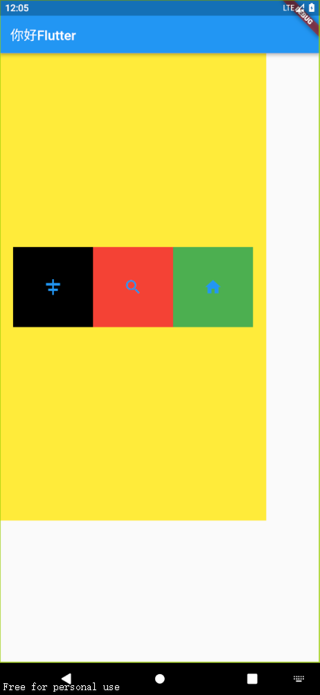
Row行组件和Column 列组件
mainAxisAlignment 主轴的排序方式,如果没有外部容器,就自适应整个页面,如果有就相对于外部容器
crossAxisAlignment 交叉轴方向的排序方式,这个是相对于外部容器的,如果没有外部容器就没有效果
mainAxisSize 主轴大小适配,
- MainAxisSize.min:宽度与子控件保持一致
- MainAxisSize.max:宽度铺满主轴方向(这个是默认值)
textDirection 子组件水平方向排列顺序,一般在Row中设置
- TextDirection.ltr:从左往右开始排列(这个是默认的方向)
- TextDirection.rtl:从右往左开始排列
verticalDirection 子组件垂直方向排列顺序,一般在Column中设置
textBaseline 文字基线
children 子元素们
在使用Row和Column组件时,我们经常使用 double.infinity 和 double.maxFinite 这个可以让当前元素的width或者height达到父元素的尺寸,其实就是设置一个无穷大的宽高,铺满外部容器,没有外部容器会铺满整个屏幕
1
2
3
4
5
6
7
8
9
10
11
12
13
14
15
16
17
18
19
20
21
22
23
24
25
26
27
28
| class MyHomePage extends StatelessWidget {
const MyHomePage({super.key});
@override
Widget build(BuildContext context) {
return Container(
width: 400,
height: 700,
color: Colors.yellow,
child: Row(
mainAxisAlignment: MainAxisAlignment.center,
crossAxisAlignment: CrossAxisAlignment.center,
textBaseline: TextBaseline.alphabetic,
textDirection: TextDirection.rtl,
children: [
IconContainer(
icon: Icons.home,
color: Colors.green,
),
IconContainer(icon: Icons.search),
IconContainer(
icon: Icons.align_horizontal_center,
color: Colors.black,
)
],
),
);
}
}
|
Flex和Expanded弹性布局组件
F1ex组件可以沿着水平或垂直方向排列子组件,如果你知道主轴方向,使用Row或Co1umn会方便一些,因为Row和Co1umn都继承自Flex,参数基本相同,所以能使用Flex的地方基本上都可以使用Row或Column。Flex本身功能是很强大的,它也可以和Expanded组件配合实现弹性布局,Expanded组件必须放在行和列或者flex组件中
1
2
3
4
5
6
7
8
9
10
11
12
13
14
15
16
17
18
19
20
21
22
| class MyHomePage extends StatelessWidget {
const MyHomePage({super.key});
@override
Widget build(BuildContext context) {
return Flex(
direction: Axis.horizontal,
children: [
Expanded(
flex: 2,
child: IconContainer(icon: Icons.search),
),
Expanded(
flex: 3,
child: IconContainer(
icon: Icons.home,
color: Colors.green,
)),
],
);
}
}
|
如果想要一边固定,另一边自适应,那么就一边固定宽高,另一边放在 Expanded 组件中,flex设置为1就好了
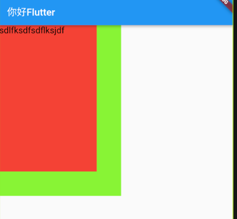
Stack 层叠布局组件
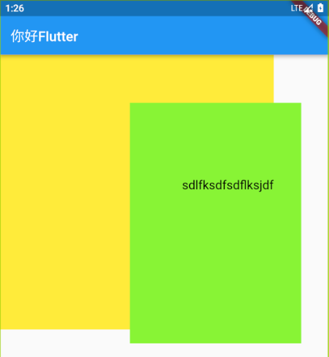
Stack 组件中children 属性内的组件是层叠的,Stack的大小是最大子控件的大小
Stack未定位的子组件通过配置 alignment 属性来选择层叠的方式
Stack未定位的子组件通过配置 fit 参数决定,默认值是StackFit.loose,表示子组件自己决定,StackFit.expand表示尽可能的大
1
2
3
4
5
6
7
8
9
10
11
12
13
14
15
16
17
18
19
20
21
22
23
24
25
| class MyHomePage extends StatelessWidget {
const MyHomePage({super.key});
@override
Widget build(BuildContext context) {
return Stack(
children: [
Container(
height: 350,
width: 250,
color: const Color.fromARGB(255, 136, 244, 54),
),
Container(
height: 300,
width: 200,
color: Colors.red,
),
const Text(
"sdlfksdfsdflksjdf",
style: TextStyle(color: Color.fromARGB(255, 0, 0, 0), fontSize: 18),
)
],
);
}
}
|
Positioned 组件
注意到上面提到的是Stack未定位的组件,那么如何给Stack中的组件进行定位呢,我们可以使用Positioned组件
Positioned 组件定位的时候是相对于Stack组件外面的组件,如果Stack组件外面没有组件那么就是相对于整个屏幕进行定位,使用的时候,在Stack 组件的children 属性中用Positioned组件包裹子组件
top 子元素距离顶部的距离
bottom 子元素距离底部的距离
height 子组件的高度
left 子元素距离左侧距离
right 子元素距离右侧距离
width 子组件的高度 (注意:宽度和高度必须是固定值,没法使用double.infinity)
child 子组件
clipBehavior 设置超出父元素的子元素的显示方式,默认是剪裁掉超出部分
注意:
left、right和width3个参数只能设置其中2个,因为设置了其中2个,第三个已经确定了,同理top、bottom和height也只能设置其中2个。- 使用Positioned组件进行定位的时候,Stack外部的组件不要设置
alignment 属性
- 使用 Positioned 组件时如果子元素是Row组件这样没有宽高的或者说宽高自适应的组件,我们还要指定宽高
- 如果我们想要组件宽铺满整个屏幕但是又没有办法使用
double.infinity 时,我们可以在build()方法中使用下面的代码获取屏幕的宽高1
2
3
| final size = MediaQuery.of(context).size
size.width
size.height
|
1
2
3
4
5
6
7
8
9
10
11
12
13
14
15
16
17
18
19
20
21
22
23
24
25
26
27
28
29
30
31
32
33
34
35
| class MyHomePage extends StatelessWidget {
const MyHomePage({super.key});
@override
Widget build(BuildContext context) {
return Container(
width: 400,
height: 400,
color: Colors.yellow,
child: Stack(
clipBehavior: Clip.none,
children: [
Positioned(
bottom: 0,
right: 0,
child: Container(
height: 350,
width: 250,
color: const Color.fromARGB(255, 136, 244, 54),
),
),
const Positioned(
right: 0,
bottom: 200,
child: Text(
"sdlfksdfsdflksjdf",
style: TextStyle(
color: Color.fromARGB(255, 0, 0, 0), fontSize: 18),
))
],
),
);
}
}
|
Align 组件
Align组件不但可以结合Stack组件,也可以结合Container组件来使用,我们之前用的Center组件就是Align组件的子类,
使用时用Align组件包裹子组件来调整子组件在外部组件的位置
1
2
3
4
5
6
7
8
9
10
11
12
13
14
15
16
17
| class MyHomePage extends StatelessWidget {
const MyHomePage({super.key});
@override
Widget build(BuildContext context) {
return Container(
width: 400,
height: 400,
color: Colors.yellow,
child: const Align(
alignment: Alignment(-0.5, 1),
child: Text("你好你好Flutter"),
),
);
}
}
|
AspectRatio 组件
AspectRatio的作用是根据设置调整子元素child的宽高比。
AspectRatio首先会在布局限制条件允许的范围内尽可能的扩展,Widget的高度是由宽度和比率决定的,类以于BoxFit中的contain,按照固定比率去尽量占满区域。如果在满足所有限制条件过后无法找到一个可行的尺寸,AspectRatio最终将会去优先适应布局限制条件,而忽略所设置的比率。
1
2
3
4
5
6
7
8
9
10
11
12
13
14
| class MyHomePage extends StatelessWidget {
const MyHomePage({super.key});
@override
Widget build(BuildContext context) {
return AspectRatio(
aspectRatio: 2 / 1,
child: Container(
color: Colors.red,
),
);
}
}
|
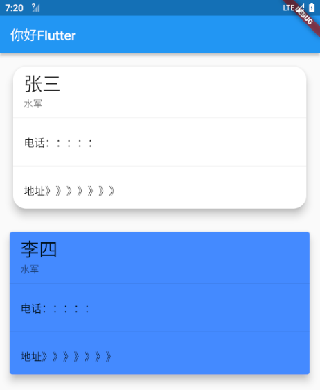
Cart 组件
Card是卡片组件块,内容可以由大多数类型的Widget组成,Cart具有圆角和阴影,这让它看起来有立体感
margin 外边距
elevation 阴影深度
color 背景颜色
shadowColor 阴影颜色
Shape Card的阴影效果,默认阴影效果为圆角的长方形边
clipBehavior 内容溢出的剪切方式
CIip.none不剪切Cip.hardEdge裁剪但不应用抗锯齿Clip.antiAlias裁剪而且抗锯齿Clip.antiAliasWithSaveLayer带有抗锯齿的剪辑,并在剪辑之后立即保存saveLayer
child 子组件
1
2
3
4
5
6
7
8
9
10
11
12
13
14
15
16
17
18
19
20
21
22
23
24
25
26
27
28
29
30
31
32
33
34
35
36
37
38
39
40
41
42
43
44
45
46
47
48
49
50
51
52
53
54
55
56
| class MyHomePage extends StatelessWidget {
const MyHomePage({super.key});
@override
Widget build(BuildContext context) {
return ListView(
children: [
Card(
elevation: 10,
margin: const EdgeInsets.all(20),
shape:
RoundedRectangleBorder(borderRadius: BorderRadius.circular(20)),
child: Column(children: const [
ListTile(
title: Text(
"张三",
style: TextStyle(fontSize: 28),
),
subtitle: Text("水军"),
),
Divider(),
ListTile(
title: Text("电话:::::"),
),
Divider(),
ListTile(
title: Text("地址》》》》》》》"),
)
]),
),
Card(
color: Colors.blueAccent,
elevation: 10,
margin: const EdgeInsets.all(15),
child: Column(children: const [
ListTile(
title: Text(
"李四",
style: TextStyle(fontSize: 28),
),
subtitle: Text("水军"),
),
Divider(),
ListTile(
title: Text("电话:::::"),
),
Divider(),
ListTile(
title: Text("地址》》》》》》》"),
)
]),
),
],
);
}
}
|
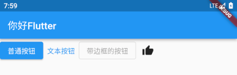
按钮组件
ElevatedButton 普通按钮
TextButton 文本按钮
OutlinedButton 带边框的按钮
IconButton 图标按钮
1
2
3
4
5
6
7
8
9
10
11
12
13
14
15
16
17
18
19
20
21
22
23
| class MyHomePage extends StatelessWidget {
const MyHomePage({super.key});
@override
Widget build(BuildContext context) {
return ListView(
children: [
Row(
children: [
ElevatedButton(
onPressed: () {
print("ElevatedButton");
},
child: const Text("普通按钮")),
TextButton(onPressed: () {}, child: const Text("文本按钮")),
const OutlinedButton(onPressed: null, child: Text("带边框的按钮")),
IconButton(onPressed: () {}, icon: const Icon(Icons.thumb_up))
],
)
],
);
}
}
|
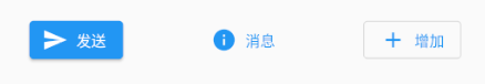
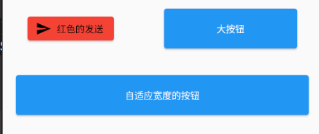
我们可以通过 icon 命名构造函数来轻松的给ElevatedButton,TextButton,OutlinedButton组件添加图标,效果入下图所示
1
2
3
4
5
6
7
8
9
10
11
12
13
14
15
16
17
| Row(
mainAxisAlignment: MainAxisAlignment.spaceAround,
children: [
ElevatedButton.icon(
onPressed: () {},
icon: const Icon(Icons.send),
label: const Text("发送")),
TextButton.icon(
onPressed: () {},
icon: const Icon(Icons.info),
label: const Text("消息")),
OutlinedButton.icon(
onPressed: () {},
icon: const Icon(Icons.add),
label: const Text("增加")),
],
)
|
通过 style 属性可以修改按钮的样式
foregroundColor 文本颜色
backgroundColor 按钮的颜色
shadowColor 阴影颜色
elevation 阴影的范围,值越大阴影范围越大
padding 内边距
shape 设置按钮的形状
side 设置边框
对于按钮的宽高,我们可以通过在按钮外部包裹 SizedBox 组件来调整
1
2
3
4
5
6
7
8
9
10
11
12
13
14
15
16
17
18
19
20
21
22
23
24
25
26
27
28
29
30
31
32
33
34
35
36
37
| class MyHomePage extends StatelessWidget {
const MyHomePage({super.key});
@override
Widget build(BuildContext context) {
return ListView(
children: [
Row(
mainAxisAlignment: MainAxisAlignment.spaceAround,
children: [
ElevatedButton.icon(
icon: const Icon(Icons.send),
style: ButtonStyle(
side: MaterialStateProperty.all(
const BorderSide(width: 2, color: Colors.green)),
backgroundColor:
MaterialStateProperty.all(Colors.red),
foregroundColor:
MaterialStateProperty.all(Colors.black)
),
onPressed: () {},
label: const Text("红色的发送"),
),
SizedBox(
height: 60,
width: 200,
child: ElevatedButton(
child: const Text("大按钮"),
onPressed: () {},
),
)
],
)
],
);
}
}
|
对于上图中的自适应宽度的按钮,我们可以在SizedBox外面包裹Expanded组件,设置其flex为 1 ,如果不想填满整个页面,可以改为使用Container组件设置一下 margin
1
2
3
4
5
6
7
8
9
10
11
12
13
14
15
16
17
18
19
20
21
22
23
24
25
| class MyHomePage extends StatelessWidget {
const MyHomePage({super.key});
@override
Widget build(BuildContext context) {
return ListView(
children: [
Row(
children: [
Expanded(
flex: 1,
child: Container(
height: 60,
margin: const EdgeInsets.all(20),
child: ElevatedButton(
child: const Text("自适应宽度的按钮"),
onPressed: () {},
),
))
],
)
],
);
}
}
|
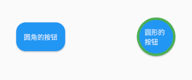
圆角和圆形的按钮,对于圆角的按钮,我们通过设置 style 属性的shape可以改变边框的形状,如下图所示
1
2
3
4
5
6
7
8
9
10
11
12
13
14
15
16
17
18
19
20
21
22
23
24
25
26
27
28
29
30
31
32
33
34
35
| class MyHomePage extends StatelessWidget {
const MyHomePage({super.key});
@override
Widget build(BuildContext context) {
return ListView(
children: [
Row(
mainAxisAlignment: MainAxisAlignment.spaceAround,
children: [
SizedBox(
height: 60,
child: ElevatedButton(
onPressed: () {},
style: ButtonStyle(
shape: MaterialStateProperty.all(RoundedRectangleBorder(
borderRadius: BorderRadius.circular(20)))),
child: const Text("圆角的按钮")),
),
SizedBox(
height: 80,
width: 80,
child: ElevatedButton(
onPressed: () {},
style: ButtonStyle(
shape: MaterialStateProperty.all(const CircleBorder(
side: BorderSide(width: 5, color: Colors.green)))),
child: const Text("圆形的按钮")),
)
],
)
],
);
}
}
|
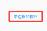
修改带边框的按钮的边框样式,修改style属性中的side属性,如下图
1
2
3
4
5
6
7
8
9
10
11
| SizedBox(
height: 40,
width: 120,
child: OutlinedButton(
onPressed: () {},
style: ButtonStyle(
side: MaterialStateProperty.all(
const BorderSide(width: 5, color: Colors.red)),
),
child: const Text("带边框的按钮")),
)
|
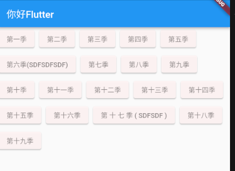
Wrap 组件
Wrap可以实现流布局,单行的Wrap跟Row表现几乎一致,单列的Wrap则跟Column表现几乎一致。但Row与Column都是单行单列的,Wrap则突破了这个限制,mainAxis上空间不足时,则向crossAxis上去扩展显示。
direction 主轴的方向,默认水平
alignment 主轴的对其方式
spacing 主轴方向上的间距
runAlignment run的对齐方式。run可以理解为新的行或者列,如果是水平方向布局的话,run可以理解为新的一行
runSpacing run的间距
textDirection 文本方向
crossAxisAlignment 列方向的对齐方式
verticalDirection 定义了children摆放顺序,默认是down,见Flex相关属性介绍。
1
2
3
4
5
6
7
8
9
10
11
12
13
14
15
16
17
18
19
20
21
22
23
24
25
26
27
28
29
30
31
32
33
34
35
36
37
38
39
40
41
42
43
44
45
46
47
48
49
50
51
52
53
54
| class MyHomePage extends StatelessWidget {
const MyHomePage({super.key});
@override
Widget build(BuildContext context) {
return Wrap(
alignment: WrapAlignment.start,
runAlignment: WrapAlignment.center,
spacing: 10,
runSpacing: 5,
children: [
MYButton( "第一季", onPressed: () {},),
MYButton( "第二季", onPressed: () {},),
MYButton( "第三季", onPressed: () {},),
MYButton( "第四季", onPressed: () {},),
MYButton( "第五季", onPressed: () {},),
MYButton( "第六季(SDFSDFSDF)", onPressed: () {},),
MYButton( "第七季", onPressed: () {},),
MYButton( "第八季", onPressed: () {},),
MYButton( "第九季", onPressed: () {},),
MYButton( "第十季", onPressed: () {},),
MYButton( "第十一季", onPressed: () {},),
MYButton( "第十二季", onPressed: () {},),
MYButton( "第十三季", onPressed: () {},),
MYButton( "第十四季", onPressed: () {},),
MYButton( "第十五季", onPressed: () {},),
MYButton( "第十六季", onPressed: () {},),
MYButton( "第 十 七 季 ( SDFSDF )", onPressed: () {},),
MYButton( "第十八季", onPressed: () {},),
MYButton( "第十九季", onPressed: () {},),
],
);
}
}
class MYButton extends StatelessWidget {
String text;
void Function()? onPressed;
MYButton(this.text, {super.key, required this.onPressed});
@override
Widget build(BuildContext context) {
return ElevatedButton(
onPressed: onPressed,
style: ButtonStyle(
backgroundColor: MaterialStateProperty.all(
const Color.fromARGB(242, 255, 244, 244)),
foregroundColor: MaterialStateProperty.all(Colors.black45)),
child: Text(text),
);
}
}
|